Overview
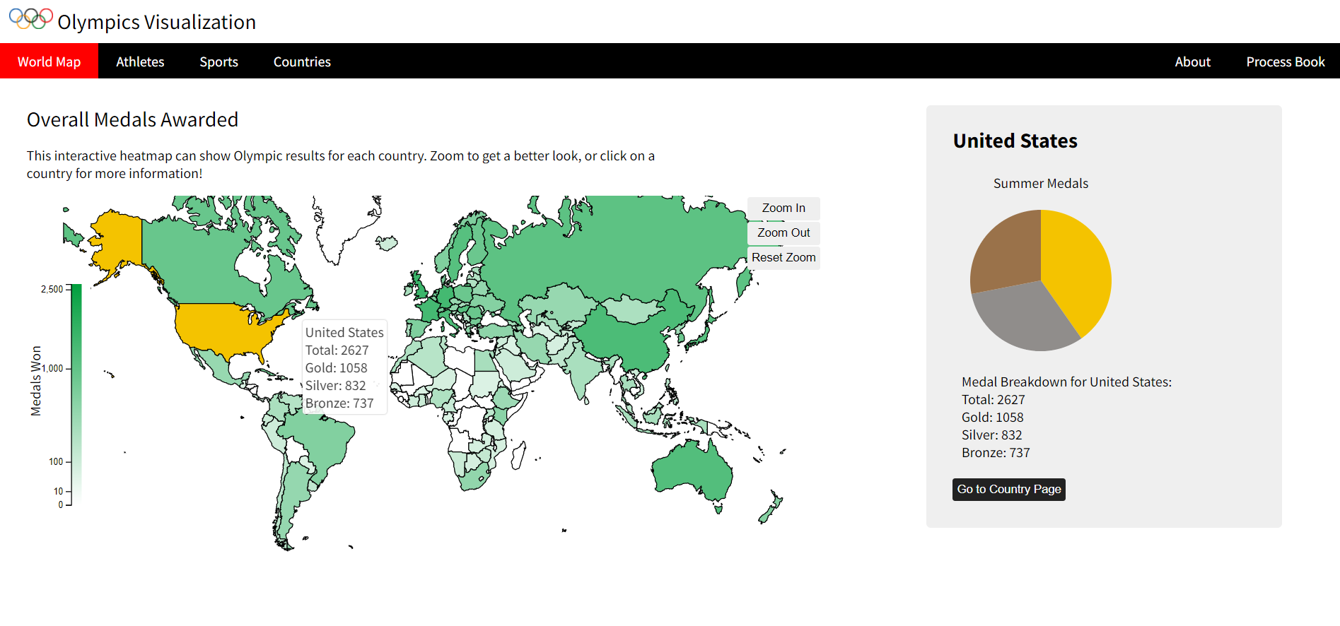
Mainstream coverage of the Olympics in the US typically covers only a few sports, and the reporters only talk about our top athletes in each one. This interactive project, made for Alvitta Ottley’s Intro to Data Visualization course, lets users view data on all Olympic sports to explore which countries have historically been the most dominant in each sport and how countries have ranked over Olympic history.
Research
When choosing the format of our visualization project, I was guided by the questions that motivated us to explore the Olympics, such as:
- Which countries are the most dominant (i.e. most medals) in each sport?
- Which sport is each country the best at?
- Do countries do better than their average when they are the ones hosting the Olympics?
- Who is the best individual athlete (most medals) in each sport?
I gave each of these questions a visualization, but this pulled me in conflicting directions for choosing the format of the graphs. I wanted to choose the best way to present the data while maintaining a visual system and way to navigate the visualizations so that the users would not have to learn a new way of exploring on each page.
Recommended Reading: Financial Times Visualizations
This resource has helped me think more critically about why I use certain visualizations over others and encourages me to learn to program a larger variety of graphs.
Takeaways
This project was a culmination of what I learned over the semester and the chance to explore the relationship between visualizations on the same screen and over several pages. It was also the largest programming project I have done as a group so far. One thing I enjoy about working on larger projects as a team is that we have the ability to divide the work to embrace our strengths. As the sole design student on the team, I took the lead in prototyping our visualizations and finding alternative designs based on user feedback.
As we interviewed our peers and watched them navigate the site, I learned how valuable it is to have people who have no familiarity with the project try to explain how it works. I found that students also in the class were more hesitant to suggest large changes because they were aware of the work we had put into our project, whereas students outside the department were more inclined to suggest new visualizations and adding new datasets to our work.