Overview
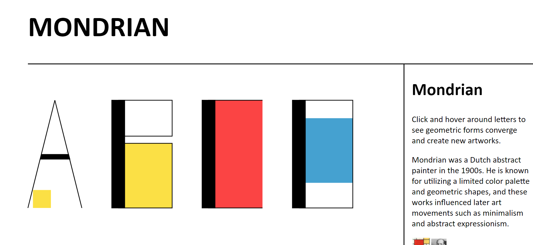
Creating micro interactions is about finding small moments of delight for a user navigating a digital space. This type specimen, made for Jonathan Hanahan's Interaction Design Capstone, explores creating a legible but surprising alphabet out of simple rectangles and lines.
Research
I had thought about modular typefaces before in my Tacopalooza project, but with this typeface I wanted to create something engaging out of very mundane parts. As a precursor to this assignment, our class created a series of 50 buttons with distinct interactions from each other to encourage us to consider ways to overlap animations in unexpected ways. One student's project that inspired me had buttons that deformed the other buttons and site as a whole which encouraged me to think about interactions that could deconstruct the letters of the specimen until the browser page resembles a piece of art more than a typeface.
Takeaways
Debugging this typeface was time consuming but was easiest for those of us who emphasized the grid and component based structure of the typeface in their jQuery as well as their design. Every letter is made of some number of five pieces- a line or polyline of various width or a rectangle in one of the primary colors. One feature I would add to this specimen if I had more time was an animation for reverting the deconstructed letters to their original form. As I learned in the parkside project, the entry and exit points in an interaction are often the most important for the user's experience.